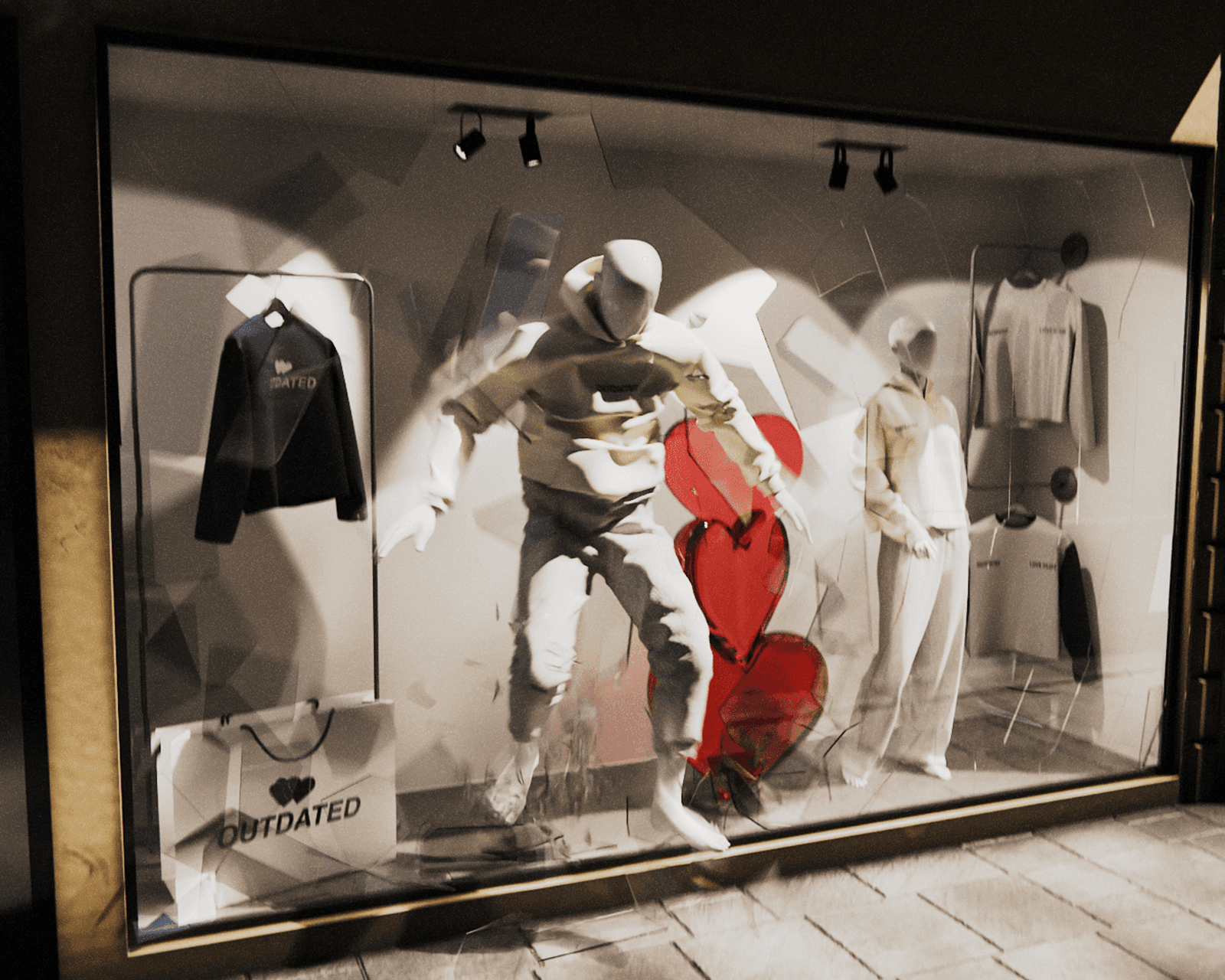
The first frame decides whether anyone sees the rest of your animation.
Everyone quotes the same statistic: you have about three seconds before someone scrolls past. I think the number is less useful than what it implies, which is that your first frame is doing more work than the rest of the piece combined.
Most animations I see fail because they treat the opening as a wind-up. A logo settling into place, a slow fade, a camera drifting toward the subject. By the time the interesting part arrives, the viewer has gone.
Start at the interesting part
The fix is unglamorous. Cut the build-up and open on movement that is already happening. If your product rotates, start mid-rotation. If something is falling, start with it already in the air.
This feels wrong when you are editing, because you lose the moment you spent the longest on. It works anyway.
Movement beats resolution
Given a choice between a sharper render and a clearer motion, take the motion. Movement is what the eye catches on a small screen at speed. A slightly softer frame that moves well will outperform a pristine frame that sits still.
This is also why phone-first matters more than it sounds. Most of your audience sees the work at about the size of a business card, at arm's length, in bad light. Detail you spent hours on may not survive that. Motion does.
What tends to hold attention
Micro animations
Hover states, icon shifts, quick transitions between images. Small enough that nobody notices them consciously, which is the point. They make an interface feel responsive rather than decorative.
Hero sections
The first thing on a website. A looping background, a slow product reveal, something that establishes tone before the visitor has read a word. This is the highest-leverage animation on most sites, because everyone sees it.
Product reveals
Short, fast, and structured around one moment. A rotation, a pour, a before and after. These work on social because they resolve quickly, and resolution is what keeps someone watching to the end.
Where I see it go wrong
The most common mistake is overloading a scene. Three things moving at once reads as noise, and the viewer stops trying to follow any of them. One clear movement, done well, is almost always better.
The second is file size. An animation that takes four seconds to load has already lost the audience it was built for. Compress harder than feels comfortable, especially for anything living on a phone.
The third is mismatch. A fast, punchy animation on a brand that presents as calm and considered reads as borrowed. The motion has to sound like the brand, in the same way the copy does.
If you are testing your own work
Watch it on your phone, at full speed, once. Not looped, not on a monitor, not scrubbing through the timeline. Once, the way a stranger would see it. If you cannot tell what the piece is about by the end of that single pass, the problem is in the first second, not the last.